Functional connectivity#

François Lespinasse 🤔 👀 |

Pierre bellec 🤔 💻 ⚠️ 👀 |
Objectives#
In the activation maps chapter, we have seen that this type of analysis emphasizes on the notion of functional segregation, which refers to the extent to which certain brain regions are specifically engaged by a certain category of cognitive processes. However, it is well known that cognitive processes also require a certain degree of functional integration, where different regions of the brain interact together to perform a task. This notion of integration leads to conceiving of the brain as a network, or a graph, that describes the functional connectivity between brain regions. This chapter introduces basic concepts used to study brain connectivity using fMRI.
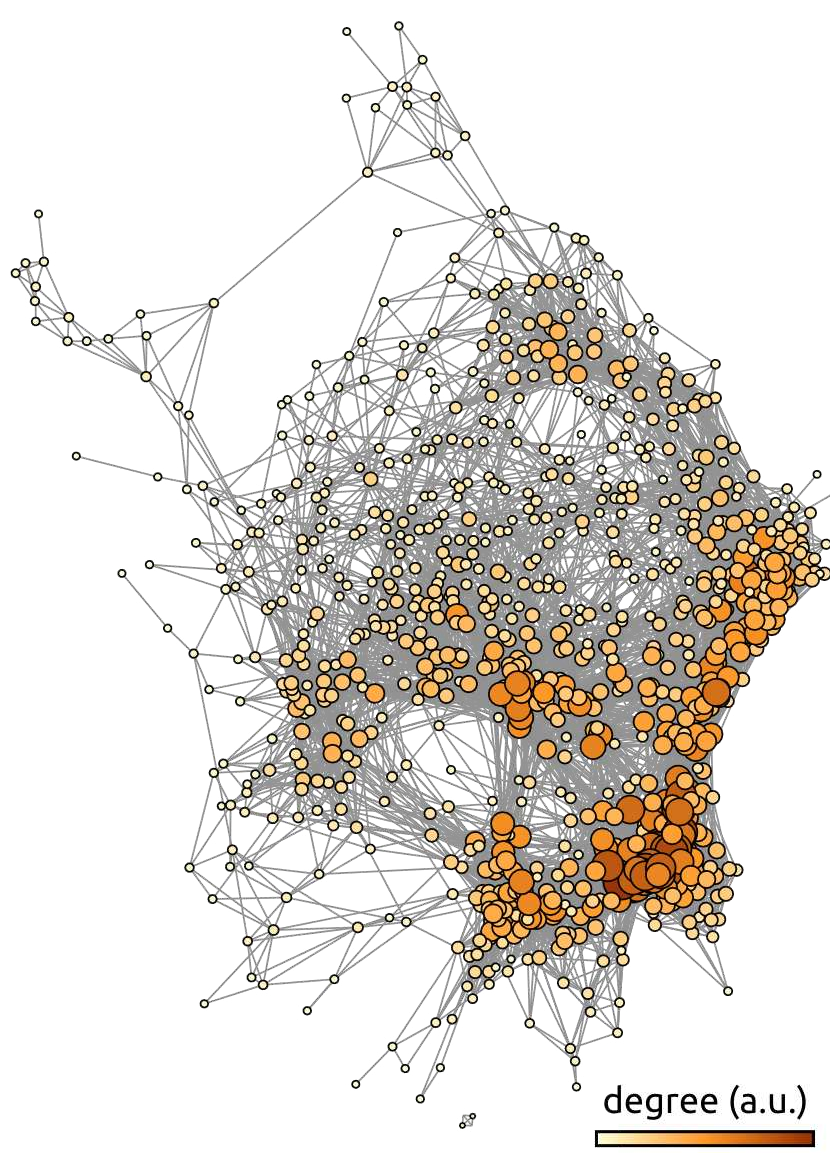
Fig. 55 Average functional connectivity graph from the ADHD-200 dataset. Each node of the graph represents a brain region, and the edges represent the average functional connectivity over the ADHD-200 dataset [3], after thresholding. The color scale and the size of the nodes represent the number of connections (degree) associated with each node. The graph is generated using the gephi library. The figure is taken from [4], under the CC-BY license.#
The specific objectives of this chapter are:
Understand the definition of functional connectivity.
Understand the notion of connectivity map.
Understand the notion of functional network.
Be familiar with the main resting-state networks.
Functional connectivity#
Show code cell source
# Importer les librairies
import numpy as np
import matplotlib.pyplot as plt
import seaborn as sns
from nilearn.image import math_img
from nilearn import plotting, input_data
from nilearn.input_data import NiftiLabelsMasker
from nilearn import datasets # Fetch data using nilearn
from nilearn.input_data import NiftiMasker

import warnings
warnings.filterwarnings("ignore")

# Initialise la figure
fig = plt.figure(figsize=(10, 9), dpi=300)

# Importe les données
basc = datasets.fetch_atlas_basc_multiscale_2015() # the BASC multiscale atlas
adhd = datasets.fetch_adhd(n_subjects=10)          # ADHD200 preprocessed data (Athena pipeline)\

# Paramètres du pré-traitement
num_data = 6
fwhm = 8
high_pass = 0.01
high_variance_confounds = False
time_samp = range(0, 100)

# Extrait le signal par parcelle pour un atlas fonctionnel (BASC)
masker = input_data.NiftiLabelsMasker(
                                      basc['scale122'],
                                      resampling_target="data",
                                      high_pass=high_pass,
                                      t_r=3,
                                      high_variance_confounds=high_variance_confounds,
                                      standardize=True,
                                      memory='nilearn_cache',
                                      memory_level=1,
                                      smoothing_fwhm=fwhm).fit()
tseries = masker.transform(adhd.func[num_data])
print(f"Time series with shape {tseries.shape} (# time points, # parcels))")

# Fonction pour montrer une parcelle
def _montre_roi(num_parcel, title, ax_plot, cmap):
    plotting.plot_roi(math_img(f'img == {num_parcel}', img=basc['scale122']),
              threshold=0.5,
              axes=ax_plot,
              vmax=1,
              cmap=cmap,
              title=title)

# Montre les parcelles
ax_plot = plt.subplot2grid((3, 3), (0, 0), colspan=2)
num_parcel1 = 73
_montre_roi(num_parcel1, "M1 droit", ax_plot, cmap='winter')

ax_plot = plt.subplot2grid((3, 3), (1, 0), colspan=2)
num_parcel2 = 8
_montre_roi(num_parcel2, "M1 gauche", ax_plot, cmap='autumn')

ax_plot = plt.subplot2grid((3, 3), (2, 0), colspan=2)
num_parcel3 = 17
_montre_roi(num_parcel3, "Cingulaire Posterieur", ax_plot, cmap='summer')

# Extrait les séries temporelles
time = np.linspace(0, 3 * (tseries.shape[0]-1), tseries.shape[0])
tseries1 = tseries[time_samp, :][:, num_parcel1 - 1] # -1 car python utilise le zero-index
tseries2 = tseries[time_samp, :][:, num_parcel2 - 1] # -1 car python utilise le zero-index
tseries3 = tseries[time_samp, :][:, num_parcel3 - 1] # -1 car python utilise le zero-index

# Fonction pour montrer les séries temporelles
def _montre_serie(y1, y2, ax_plot, color1, color2):
    ax_plot.set_aspect('40')
    plt.plot(time[time_samp], y1, color1)
    plt.plot(time[time_samp], y2, color2)
    plt.xlabel('Temps (s.)')
    plt.ylabel('BOLD (u.a.)')
    plt.title(f'Séries temporelles (r={np.corrcoef(y1, y2)[1, 0]:.2f})')

# plot les séries temporelles
ax_plot = plt.subplot2grid((3, 3), (0, 2), colspan=1)
_montre_serie(tseries1, tseries2, ax_plot, 'b-', 'r-')
ax_plot = plt.subplot2grid((3, 3), (1, 2), colspan=1)
_montre_serie(tseries1, tseries3, ax_plot, 'b-', 'g-')
ax_plot = plt.subplot2grid((3, 3), (2, 2), colspan=1)
_montre_serie(tseries2, tseries3, ax_plot, 'r-', 'g-')

from myst_nb import glue
glue("connectivity-fig", fig, display=False)
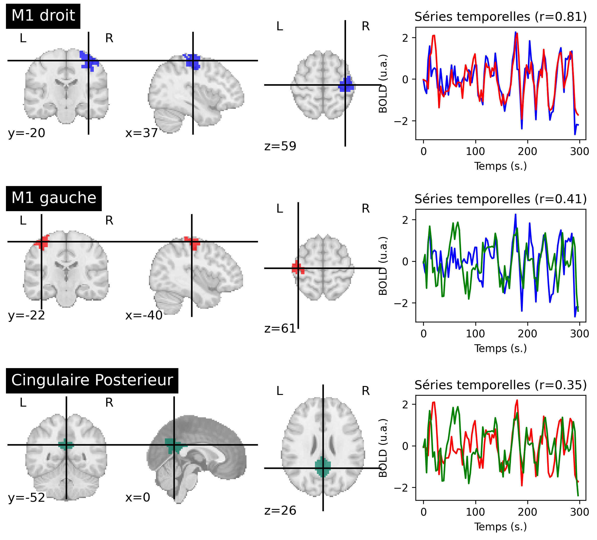
Fig. 56 Functional connectivity between brain regions, for a participant from the ADHD-200 dataset [3]. For each region (on the left), the average activity is extracted. For each pair of regions, connectivity is measured by the r correlation between the associated time series (on the right). The colors of the regions and time series correspond to each other. This figure is generated by python code using the nilearn library (click on + to see the code), and is distributed under the CC-BY license.#
Functional connectivity is a relatively generic term used to describe a measure of the spatial dependencies of brain activity [20]. The simplest technique for conducting this type of analysis is to extract the time courses of two regions and determine their r correlation. Functional connectivity is then interpreted as follows within the framework of the experiment:
strong (
rclose to 1): the two brain regions are involved in similar cognitive processes,weak (
rclose to zero): the cognitive processes are independent,negative (
rclose to -1): the cognitive processes are mutually exclusive.
In the example presented in Fig. 56, the regions M1 right and M1 left have a strong functional connectivity between them, and a moderate functional connectivity with the posterior cingulate region.
Correlation measure
Correlation between two time series is a measure that varies between -1 and 1. If the two series are identical (from their mean and variance), the correlation is 1. If the two series are statistically independent, the correlation is close to zero. If the two series are mirror images of each other, the correlation is -1.
Functional connectivity map#
Show code cell source
# Importer les librairies
import numpy as np
import matplotlib.pyplot as plt
import seaborn as sns
from nilearn.image import math_img
from nilearn import plotting, input_data
from nilearn.input_data import NiftiLabelsMasker
from nilearn import datasets # Fetch data using nilearn
from nilearn.input_data import NiftiMasker


import warnings
warnings.filterwarnings("ignore")

# Initialise la figure
fig = plt.figure(figsize=(10, 8), dpi=300)

# Importe les données
basc = datasets.fetch_atlas_basc_multiscale_2015() # the BASC multiscale atlas
adhd = datasets.fetch_adhd(n_subjects=10)          # ADHD200 preprocessed data (Athena pipeline)\

# Paramètres du pré-traitement
num_data = 6
fwhm = 8
high_pass = 0.01
high_variance_confounds = False
time_samp = range(0, 100)

# Extrait le signal par parcelle pour un atlas fonctionnel (BASC)
masker = input_data.NiftiLabelsMasker(
                                      basc['scale122'],
                                      resampling_target="data",
                                      high_pass=high_pass,
                                      t_r=3,
                                      high_variance_confounds=high_variance_confounds,
                                      standardize=True,
                                      memory='nilearn_cache',
                                      memory_level=1,
                                      smoothing_fwhm=fwhm).fit()
tseries = masker.transform(adhd.func[num_data])
print(f"Time series with shape {tseries.shape} (# time points, # parcels))")

# Charge les données par voxel
masker_voxel = input_data.NiftiMasker(high_pass=high_pass,
                                      t_r=3,
                                      high_variance_confounds=high_variance_confounds,
                                      standardize=True,
                                      smoothing_fwhm=fwhm
                                     ).fit(adhd.func[num_data])
tseries_voxel = masker_voxel.transform(adhd.func[num_data])
print(f"Time series with shape {tseries_voxel.shape} (# time points, # voxels))")

# Montre une parcelle
ax_plot = plt.subplot2grid((2, 3), (0, 0), colspan=2)
num_parcel = 73
plotting.plot_roi(math_img(f'img == {num_parcel}', img=basc['scale122']),
                  threshold=0.5,
                  axes=ax_plot,
                  vmax=1,
                  title="région cible (M1 droit)")

# plot la série temporelle d'une région
ax_plot = plt.subplot2grid((2, 3), (0, 2), colspan=1)
ax_plot.set_aspect('40')
time = np.linspace(0, 3 * (tseries.shape[0]-1), tseries.shape[0])
plt.plot(time[time_samp], tseries[time_samp, :][:, num_parcel - 1], '-'),
plt.xlabel('Temps (s.)'),
plt.ylabel('BOLD (u.a.)')
plt.title('Série temporelle')

# carte de connectivité
ax_plot = plt.subplot2grid((2, 3), (1, 0), colspan=2)
seed_to_voxel_correlations = (np.dot(tseries_voxel.T, tseries[:, num_parcel-1]) / tseries.shape[0])# Show the connectivity map
conn_map = masker_voxel.inverse_transform(seed_to_voxel_correlations.T)
plotting.plot_stat_map(conn_map,
                       threshold=0.5,
                       vmax=1,
                       axes=ax_plot,
                       cut_coords=(37, -20, 59),
                       title="carte de connectivité (M1 droit)")

from myst_nb import glue
glue("fcmri-map-fig", fig, display=False)
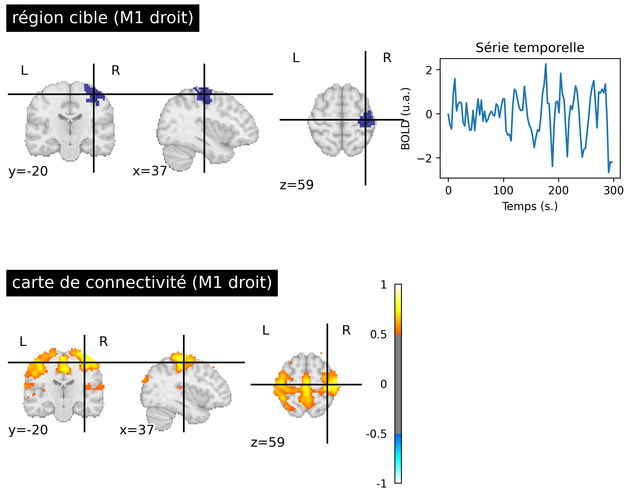
Fig. 57 Resting-state connectivity maps generated from fMRI data of a participant from the ADHD-200 dataset [3] (bottom, right). The target region used is in the right sensorimotor cortex (top, left) identifying the sensorimotor network. The first five minutes of BOLD activity associated with the target region are shown (top, right). This figure is generated by python code using the nilearn library (click on + to see the code), and is distributed under the CC-BY license.#
The concept of resting-state functional mapping was introduced by Biswal and colleagues (1995) [21]. Instead of examining the functionnal connectivity between two regions, they compared the activity of a target region with all voxels in the brain. [21] used a region in the right primary sensorimotor cortex. This target region was identified using an activation map and a motor task. Biswal and colleagues then had the idea of observing the BOLD fluctuations in a resting condition, in the absence of an experimental task. This map revealed a distributed set of regions (see Fig. 57, right M1 target), including the left sensorimotor cortex, as well as the supplementary motor area, premotor cortex, and other brain regions known for their involvement in the motor network. Initially, this study sparked considerable skepticism, as these patterns of correlated functional activity could have been perceived as reflecting cardiac or respiratory noise.
Slow fluctuations
Another key observation by Biswal and colleagues (1995) [21] is that the resting-state BOLD signal is dominated by slow fluctuations, with bursts of activity lasting 20 to 30 seconds, clearly visible in Fig. 56. More specifically, the spectrum of the resting-state BOLD signal is dominated by frequencies below 0.08 Hz, and even 0.03-0.05 Hz.
Resting-state BOLD activity and electrophysiology
The work of Shmuel and colleagues (2008) [22] demonstrated that resting-state BOLD activity correlates with spontaneous fluctuations in neuronal activity in the visual cortex of an anesthetized macaque. This shows that functional connectivity reflects at least partially the synchrony of neuronal activity, and not simply physiological noise (cardiac, respiratory).
Default mode network#
Show code cell source
# Importe les librairies
import numpy as np
import matplotlib.pyplot as plt
import seaborn as sns
from nilearn.image import math_img
from nilearn import plotting, input_data
from nilearn.input_data import NiftiLabelsMasker
from nilearn import datasets # Fetch data using nilearn
from nilearn.input_data import NiftiMasker


import warnings
warnings.filterwarnings("ignore")

# Initialise la figure
fig = plt.figure(figsize=(10, 11), dpi=300)

# Importe les données
basc = datasets.fetch_atlas_basc_multiscale_2015() # the BASC multiscale atlas
adhd = datasets.fetch_adhd(n_subjects=10)          # ADHD200 preprocessed data (Athena pipeline)\

# Paramètres du pré-traitement
num_data = 6
fwhm = 8
high_pass = 0.01
high_variance_confounds = False
time_samp = range(0, 100)

# Extrait le signal par parcelle pour un atlas fonctionnel (BASC)
masker = input_data.NiftiLabelsMasker(
                                      basc['scale122'],
                                      resampling_target="data",
                                      high_pass=high_pass,
                                      t_r=3,
                                      high_variance_confounds=high_variance_confounds,
                                      standardize=True,
                                      memory='nilearn_cache',
                                      memory_level=1,
                                      smoothing_fwhm=fwhm).fit()
tseries = masker.transform(adhd.func[num_data])
print(f"Time series with shape {tseries.shape} (# time points, # parcels))")

# Charge les données par voxel
masker_voxel = input_data.NiftiMasker(high_pass=high_pass,
                                      t_r=3,
                                      high_variance_confounds=high_variance_confounds,
                                      standardize=True,
                                      smoothing_fwhm=fwhm
                                     ).fit(adhd.func[num_data])
tseries_voxel = masker_voxel.transform(adhd.func[num_data])
print(f"Time series with shape {tseries_voxel.shape} (# time points, # voxels))")

# Montre une parcelle
ax_plot = plt.subplot2grid((4, 3), (0, 0), colspan=2)
num_parcel = 17
plotting.plot_roi(math_img(f'img == {num_parcel}', img=basc['scale122']),
                  threshold=0.5,
                  axes=ax_plot,
                  vmax=1,
                  title="région cible (PCC)")

# plot la série temporelle d'une région
ax_plot = plt.subplot2grid((4, 3), (0, 2), colspan=1)
ax_plot.set_aspect('40')
time = np.linspace(0, 3 * (tseries.shape[0]-1), tseries.shape[0])
plt.plot(time[time_samp], tseries[time_samp, :][:, num_parcel - 1]),
plt.xlabel('Temps (s.)'),
plt.ylabel('BOLD (u.a.)')
plt.title('Série temporelle')

# carte de connectivité
ax_plot = plt.subplot2grid((4, 3), (1, 0), colspan=2)
seed_to_voxel_correlations = (np.dot(tseries_voxel.T, tseries[:, num_parcel-1]) / tseries.shape[0])# Show the connectivity map
conn_map = masker_voxel.inverse_transform(seed_to_voxel_correlations.T)
plotting.plot_stat_map(conn_map,
                       threshold=0.5,
                       vmax=1,
                       axes=ax_plot,
                       cut_coords=(0, -52, 26),
                       title="carte de connectivité (PCC)")

from myst_nb import glue
glue("fcmri-dmn-fig", fig, display=False)
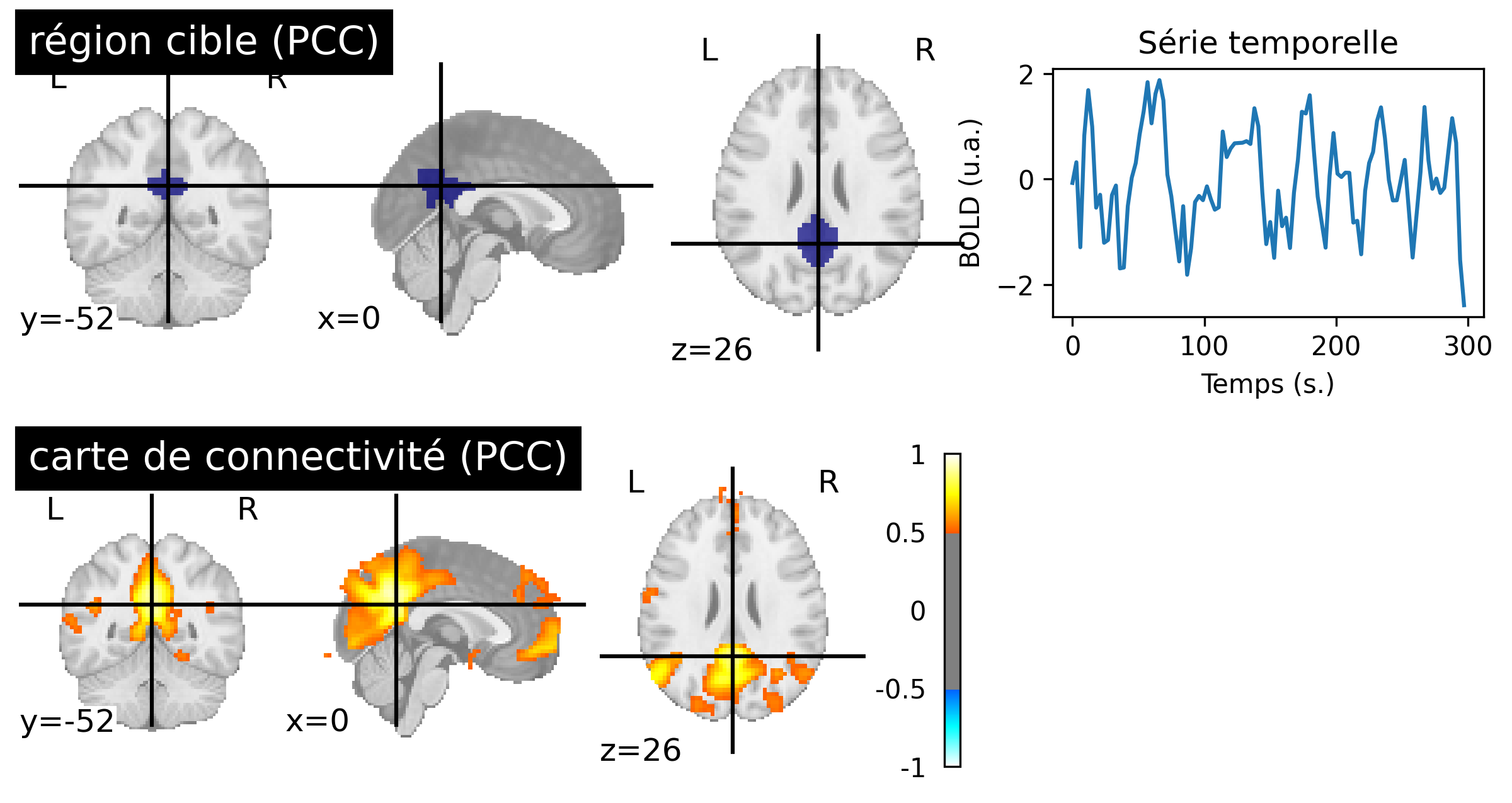
Fig. 58 Resting-state connectivity maps generated from fMRI data of a participant from the ADHD-200 dataset [3] (bottom, right). The target region used is in the posterior cingulate cortex (top, left) identifying the default mode network. The first five minutes of BOLD activity associated with the target region are shown (top, right). This figure is generated by python code using the nilearn library (click on + to see the code), and is distributed under the CC-BY license.#
The credibility of resting-state connectivity maps was strengthened when different research groups were able to identify other networks using different target regions, including the visual and auditory networks. However, it was the study of Greicius et colleagues, in 2003 [23] that sparked enourmous interest in resting-state connectivity maps using a target region in the posterior cingulate cortext (PCC) to identify a functional network that had not yet been identified: the default mode network (see Fig. 58, PCC target). We will discuss the origins of this network in the next section.
Intra- and inter-individual variability
Fig. 58 may give the impression that connectivity networks are extremely stable. In reality, connectivity maps vary significantly over time, meaning when looking at different windows of activity for the same individual, and also between individuals. Indeed, the coordinates of a target region may be partially inacurrate even with image registration. Characterizing the intra- and inter-individual variability of connectivity maps is an active area of research.
Deactivations#
Show code cell source
# Importer les librairies
import numpy as np
import matplotlib.pyplot as plt
import pandas as pd
from nilearn import datasets
from nilearn.image import math_img
from nilearn import image
from nilearn import masking
from nilearn.glm.first_level import FirstLevelModel
from nilearn import input_data
from nilearn.input_data import NiftiLabelsMasker
from nilearn.input_data import NiftiMasker
from nilearn import plotting

# initialisation de la figure
fig = plt.figure(figsize=(8, 4))

# load fMRI data
subject_data = datasets.fetch_spm_auditory()
fmri_img = image.concat_imgs(subject_data.func)

# Make an average
mean_img = image.mean_img(fmri_img)
mask = masking.compute_epi_mask(mean_img)

# Clean and smooth data
fmri_img = image.clean_img(fmri_img, high_pass=0.01, t_r=7, standardize=False)
fmri_img = image.smooth_img(fmri_img, 8.)

# load events
events = pd.read_table(subject_data['events'])

# Fit model
fmri_glm = FirstLevelModel(t_r=7,
                           drift_model='cosine',
                           signal_scaling=False,
                           mask_img=mask,
                           minimize_memory=False)

fmri_glm = fmri_glm.fit(fmri_img, events)

# Extract activation clusters
z_map = fmri_glm.compute_contrast('active - rest')

# plot activation map
ax_plot = plt.gca()
plotting.plot_stat_map(
        z_map, threshold=2, vmax=5, figure=fig,
        axes=ax_plot, colorbar=True, cut_coords=(3., -21, 45), bg_img=mean_img, title='carte d\'activation (auditif)')

# Glue the figure
from myst_nb import glue
glue("deactivation-fig", fig, display=False)
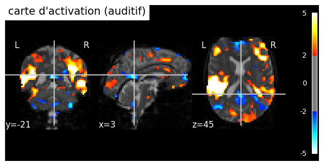
Fig. 59 Individual activation map in an auditory paradigm (spm_auditory dataset). The significance threshold is selected liberally (|z|>2). A moderate deactivation is identified in different regions of the brain, including the posterior cingulate cortex (PCC) and the medial prefrontal cortex (mPFC). The PCC and the mPFC are key regions of the default mode network, This figure is generated by python code using the nilearn library(click on + to see the code), and is distributed under the CC-BY license.#
The default mode network (DMN) was initially discoverd through activation studies [24], which combined 9 PET studies using the same control condition od “rest” (consisting of passively viewing visual stimuli). The authors demonstrated that a set of regions are consistently more engaged at rest than during various cognitively demanding tasks. These regions include notably the posterior cingulate cortex (PCC). The “default mode hypothesis” posits that there are certain introspective cognitive processes that are systematically present in a resting state, and there exists a functional network that supports this “default” activity [25]. Resting-state fMRI connectivity maps with a target region in the PCC also identify the default mode network, as seen in Fig. 58.
DAN and negative correlations#
Show code cell source
# Importer les librairies
import numpy as np
import matplotlib.pyplot as plt
import pandas as pd
from nilearn import datasets
from nilearn.image import math_img
from nilearn import image
from nilearn import masking
from nilearn.glm.first_level import FirstLevelModel
from nilearn import input_data
from nilearn.input_data import NiftiLabelsMasker
from nilearn.input_data import NiftiMasker
from nilearn import plotting

# initialisation de la figure
fig = plt.figure(figsize=(12,8))

# Importe les données
basc = datasets.fetch_atlas_basc_multiscale_2015() # the BASC multiscale atlas
adhd = datasets.fetch_adhd(n_subjects=10)          # ADHD200 preprocessed data (Athena pipeline)\

# Paramètres du pré-traitement
num_data = 1
fwhm = 8
high_pass = 0.01
high_variance_confounds = False
time_samp = range(0, 100)

# Extrait le signal par parcelle pour un atlas fonctionnel (BASC)
masker = input_data.NiftiLabelsMasker(
                                      basc['scale122'],
                                      resampling_target="data",
                                      high_pass=high_pass,
                                      t_r=3,
                                      high_variance_confounds=high_variance_confounds,
                                      standardize=True,
                                      memory='nilearn_cache',
                                      memory_level=1,
                                      smoothing_fwhm=fwhm).fit()
tseries = masker.transform(adhd.func[num_data])
print(f"Time series with shape {tseries.shape} (# time points, # parcels))")

# Charge les données par voxel
masker_voxel = input_data.NiftiMasker(high_pass=high_pass,
                                      t_r=3,
                                      high_variance_confounds=high_variance_confounds,
                                      standardize=True,
                                      smoothing_fwhm=fwhm
                                     ).fit(adhd.func[num_data])
tseries_voxel = masker_voxel.transform(adhd.func[num_data])
print(f"Time series with shape {tseries_voxel.shape} (# time points, # voxels))")

# Applique une correction du signal global
from nilearn.signal import clean as signal_clean
gb_signal = signal_clean(
                        tseries.mean(axis=1).reshape([tseries.shape[0], 1]),
                        high_pass=high_pass,
                        t_r=3,
                        standardize=True)
tseries = masker.transform(adhd.func[num_data], confounds=gb_signal)
tseries_voxel = masker_voxel.transform(adhd.func[num_data], confounds=gb_signal)

# Montre une parcelle
ax_plot = plt.subplot2grid((2, 3), (0, 0), colspan=2)
num_parcel = 113
plotting.plot_roi(math_img(f'img == {num_parcel}', img=basc['scale122']),
                  threshold=0.5,
                  axes=ax_plot,
                  vmax=1,
                  title="région cible (FEF)")

# plot la série temporelle d'une région
ax_plot = plt.subplot2grid((2, 3), (0, 2), colspan=1)
ax_plot.set_aspect('40')
time = np.linspace(0, 3 * (tseries.shape[0]-1), tseries.shape[0])
plt.plot(time[time_samp], tseries[time_samp, :][:, num_parcel - 1]),
plt.xlabel('Temps (s.)'),
plt.ylabel('BOLD (u.a.)')
plt.title('Série temporelle')

# carte de connectivité
ax_plot = plt.subplot2grid((2, 3), (1, 0), colspan=2)
seed_to_voxel_correlations = (np.dot(tseries_voxel.T, tseries[:, num_parcel - 1]) / tseries.shape[0])# Show the connectivity map
conn_map = masker_voxel.inverse_transform(seed_to_voxel_correlations.T)
plotting.plot_stat_map(conn_map,
                       threshold=0.2,
                       vmax=1,
                       axes=ax_plot,
                       cut_coords=(-28, 2, 28),
                       display_mode = 'x',
                       title="carte de connectivité (FEF)")

# Glue the figure
from myst_nb import glue
glue("negative-DMN-fig", fig, display=False)
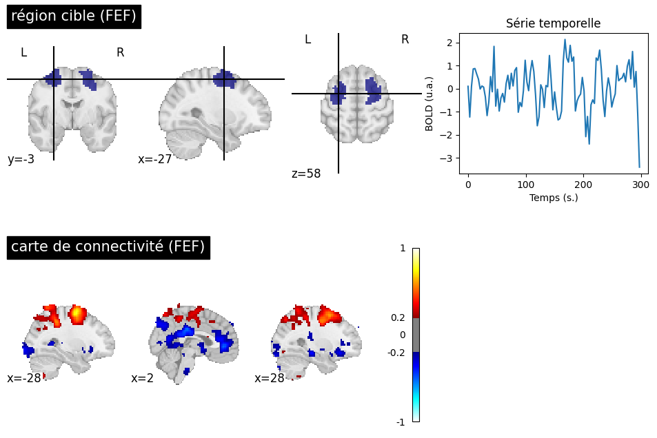
Fig. 60 A target region is selected at the level of the frontal eye field (FEF) to generate a connectivity map for a participant from the ADHD-200 dataset [3]. The significance threshold is selected liberally (|r|>0.2). In addition to the dorsal attention network (DAN) associated with the FEF, the connectivity map highlights a negative correlation with the PCC and the anterior cingulate cortex (ACC). The ACC and the PCC are key regions of the default mode network. This figure is generated by python code using the nilearn library (click on + to see the code), and is distributed under the CC-BY license.#
The default mode network is not the only one that can be identified during rest. We have already seen the sensorimotor network, which was first identified by Biswal and colleagues. Another network commonly examined in the litterature is the dorsal attention network (DAN), which includes the superior intraparietal sulcus and the frontal eye field. The DAN is often identified as activated in experiments using cognitively demanding fMRI tasks and is sometimes referred to as the “task positive network” - even though it is not positively engaged by all tasks. In 2005, Fox et al. [26] observed a negative correlation between the DAN and the default mode network. This analysis reinforces the notion of spontaneous transitions between a state directed towards external stimuli and an introspective state, reflecting the competition between two distributed networks.
Controversies on global signal regression
The negative correlations in Fig. 60 are strong only when certain data denoising steps are applied, notably the global signal regression. A significant controversy has arisen around negative connections, as some researchers believe they are an artifact related to this preprocessing step. However, negative correlations can be observed robustly in participants who move very little, and thus have particularly clean signals. Their amplitude, however, is low in the absence of global signal regression.
Intrinsic and extrinsic activity
Resting-state networks can be observed even in the presence of a task. Rather than opposing the concepts of rest and task, it is common to refer to intrinsic and extrinsic activity. Extrinsic activity is the activity elicited by a task and reflects how the environment influences brain activity. In contrast, intrinsic activity refers to brain activity that arises spontaneously and is independent of external stimuli. Both types of activity are always present and can interact with each other.
Connectomes et networks#
Show code cell source
# Importe les librairies
import numpy as np
import matplotlib.pyplot as plt
import pandas as pd
from nilearn import datasets
from nilearn.image import math_img
from nilearn import image
from nilearn import masking
from nilearn.glm.first_level import FirstLevelModel
from nilearn import input_data
from nilearn.input_data import NiftiLabelsMasker
from nilearn.input_data import NiftiMasker
from nilearn import plotting

# initialisation de la figure
fig = plt.figure(figsize=(12, 5), dpi=300)

# Importe les données
basc = datasets.fetch_atlas_basc_multiscale_2015() # the BASC multiscale atlas
adhd = datasets.fetch_adhd(n_subjects=10)          # ADHD200 preprocessed data (Athena pipeline)\

# Paramètres du pré-traitement
num_data = 1
fwhm = 8
high_pass = 0.01
high_variance_confounds = False
time_samp = range(0, 100)

# Extrait le signal par parcelle pour un atlas fonctionnel (BASC)
masker = input_data.NiftiLabelsMasker(
                                      basc['scale122'],
                                      resampling_target="data",
                                      high_pass=high_pass,
                                      t_r=3,
                                      high_variance_confounds=high_variance_confounds,
                                      standardize=True,
                                      memory='nilearn_cache',
                                      memory_level=1,
                                      smoothing_fwhm=fwhm).fit()
tseries = masker.transform(adhd.func[num_data])
print(f"Time series with shape {tseries.shape} (# time points, # parcels))")


# Applique une correction du signal global
from nilearn.signal import clean as signal_clean
gb_signal = signal_clean(
                        tseries.mean(axis=1).reshape([tseries.shape[0], 1]),
                        high_pass=high_pass,
                        t_r=3,
                        standardize=True)
tseries = masker.transform(adhd.func[num_data], confounds=gb_signal)

# Affiche le template
ax_plot = plt.subplot2grid((2, 4), (0, 0), colspan=2)
plotting.plot_roi(basc['scale122'], title="parcellisation", axes=ax_plot, colorbar=True, cmap="turbo")

# We generate a connectome
from nilearn.connectome import ConnectivityMeasure
conn = np.squeeze(ConnectivityMeasure(kind='correlation').fit_transform([tseries]))

# we use scipy's hierarchical clustering implementation
from scipy.cluster.hierarchy import dendrogram, linkage, cut_tree
# That's the hierarchical clustering step
hier = linkage(conn, method='average', metric='euclidean') # scipy's hierarchical clustering
# HAC proceeds by iteratively merging brain regions, which can be visualized with a tree
res = dendrogram(hier, get_leaves=True, no_plot=True) # Generate a dendrogram from the hierarchy
order = res.get('leaves') # Extract the order on parcels from the dendrogram
part = np.squeeze(cut_tree(hier, n_clusters=10))

# Montre le connectome
ax_plot = plt.subplot2grid((2, 4), (0, 2), rowspan=2, colspan=2)
ax_plot.set_xlabel('régions')
ax_plot.set_title('connectome')
pos = ax_plot.imshow(conn[order, :][:, order], cmap='turbo', interpolation='nearest')
fig.colorbar(pos, ax=ax_plot)

# Montre les réseaux
ax_plot = plt.subplot2grid((2, 4), (1, 0), colspan=2)
part_img = masker.inverse_transform(part.reshape([1, 122]) + 1) # note the sneaky shift to 1-indexing
plotting.plot_roi(part_img,
                  title="réseaux",
                  colorbar=True,
                  cmap="turbo",
                  axes=ax_plot,
                  cut_coords=[0, -52, 26])

# Glue the figure
from myst_nb import glue
glue("network-fig", fig, display=False)
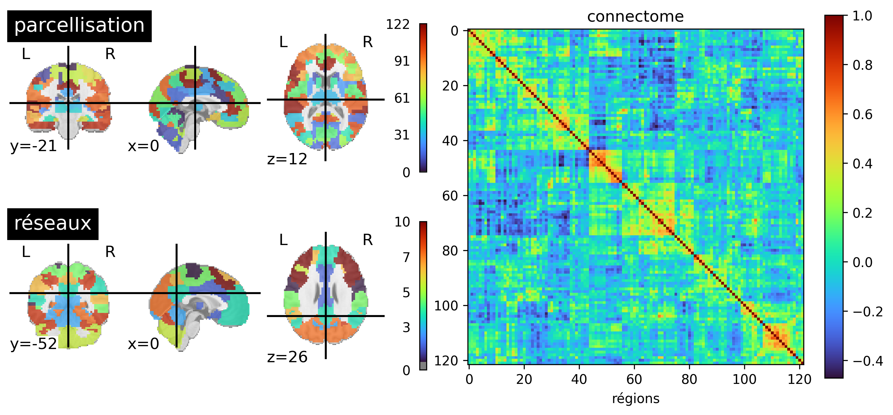
Fig. 61 A functional brain parcellation with 122 parcels is presented on the left (BASC). In the center, a matrix is shown where each element represents the correlation between the activity of two parcels. The parcels have been ordered to highlight diagonal squares: these are groups or regions whose activity strongly correlates with each other and less so with the rest of the brain. Clustering algorithms automatically detect these groups of parcels, called functional networks. An example of functional networks generated with hierarchical clustering is presented on the right, which identifies, among others, the default mode network. This figure is generated by python code using the nilearn library (click on + to see the code), and is distributed under the CC-BY license.#
We have repeatedly mentioned functional network, but without really defining what it is. When using a connectivity map, the functionnal network is the set of regions that appear in the map and are therefore connected to our target region. However, this approach depends on the target region. Yet, it is intuitive that all connectivity maps using targets in, for example, the default mode network will look similar. To formalize this intuition, we need to consider the connectivity of all pairs of regions simultaneously, a notion called functional connectome. By using unsupervised learning techniques, such as clustering, it is possible to identify groups of brain regions that are strongly connected to each other and weakly connected to the rest of the brain. This is the most common definition of a functional network. This approach allows for the division of the brain into networks, in an automatic and data-driven way, see Fig. 61 (bottom, left).
Connectome
A functional connectome is a matrix representing all the (functional) connexions in the brain, see Fig. 61 (right). Each row and each column represent a brain region. The r values found in the matrix correspond to the correlation of the temporal activity of the regions, as seen in Fig. 56. To generate a connectome, we start by selecting a brain parcellation into regions (Fig. 61, top left), then calculate the correlation of the temporal activity for all pairs of parcels in the brain.
Brain networks atlases#
Show code cell source
import warnings
warnings.filterwarnings("ignore")

from nilearn import datasets # Fetch data using nilearn
atlas_yeo = datasets.fetch_atlas_yeo_2011()        # the Yeo-Krienen atlas

# initialisation de la figure
fig = plt.figure(figsize=(24, 16), dpi=300)

# Let's plot the Yeo-Krienen 7 clusters parcellation
from nilearn import plotting
from nilearn.image import math_img
import matplotlib.pyplot as plt
ax_plot = plt.subplot(4, 2, 1)
plotting.plot_roi(atlas_yeo.thick_7, title='Yeo-Krienen atlas-7',
                  colorbar=True, cmap='Paired', axes=ax_plot)

ax_plot = plt.subplot(4, 2, 2)
plotting.plot_roi(math_img('(img==1).astype(\'float\')', img=atlas_yeo.thick_7), title='Visuel',
                  colorbar=True, cmap='Paired', axes=ax_plot, vmin=1, vmax=7)

ax_plot = plt.subplot(4, 2, 3)
plotting.plot_roi(math_img('2 * (img==2).astype(\'float\')', img=atlas_yeo.thick_7), title='Sensorimoteur',
                  colorbar=True, cmap='Paired', axes=ax_plot, vmin=1, vmax=7)

ax_plot = plt.subplot(4, 2, 4)
plotting.plot_roi(math_img('3 * (img==3).astype(\'float\')', img=atlas_yeo.thick_7), title='Attentionnel dorsal',
                  cut_coords=(-27, -5, 58), colorbar=True, cmap='Paired', axes=ax_plot, vmin=1, vmax=7)

ax_plot = plt.subplot(4, 2, 5)
plotting.plot_roi(math_img('4 * (img==4).astype(\'float\')', img=atlas_yeo.thick_7), title='Attentionnel ventral / salience',
                  cut_coords=(-3, 19, 24), colorbar=True, cmap='Paired', axes=ax_plot, vmin=1, vmax=7)

ax_plot = plt.subplot(4, 2, 6)
plotting.plot_roi(math_img('5 * (img==5).astype(\'float\')', img=atlas_yeo.thick_7), title='mésolimbique',
                  colorbar=True, cmap='Paired', axes=ax_plot, vmin=1, vmax=7)

ax_plot = plt.subplot(4, 2, 7)
plotting.plot_roi(math_img('6 * (img==6).astype(\'float\')', img=atlas_yeo.thick_7), title='frontopariétal',
                  colorbar=True, cmap='Paired', axes=ax_plot, vmin=1, vmax=7)

ax_plot = plt.subplot(4, 2, 8)
plotting.plot_roi(math_img('7 * (img==7).astype(\'float\')', img=atlas_yeo.thick_7), title='mode par défaut',
                  colorbar=True, cmap='Paired', axes=ax_plot, vmin=1, vmax=7)

# Glue the figure
from myst_nb import glue
glue("yeo-krienen-fig", fig, display=False)
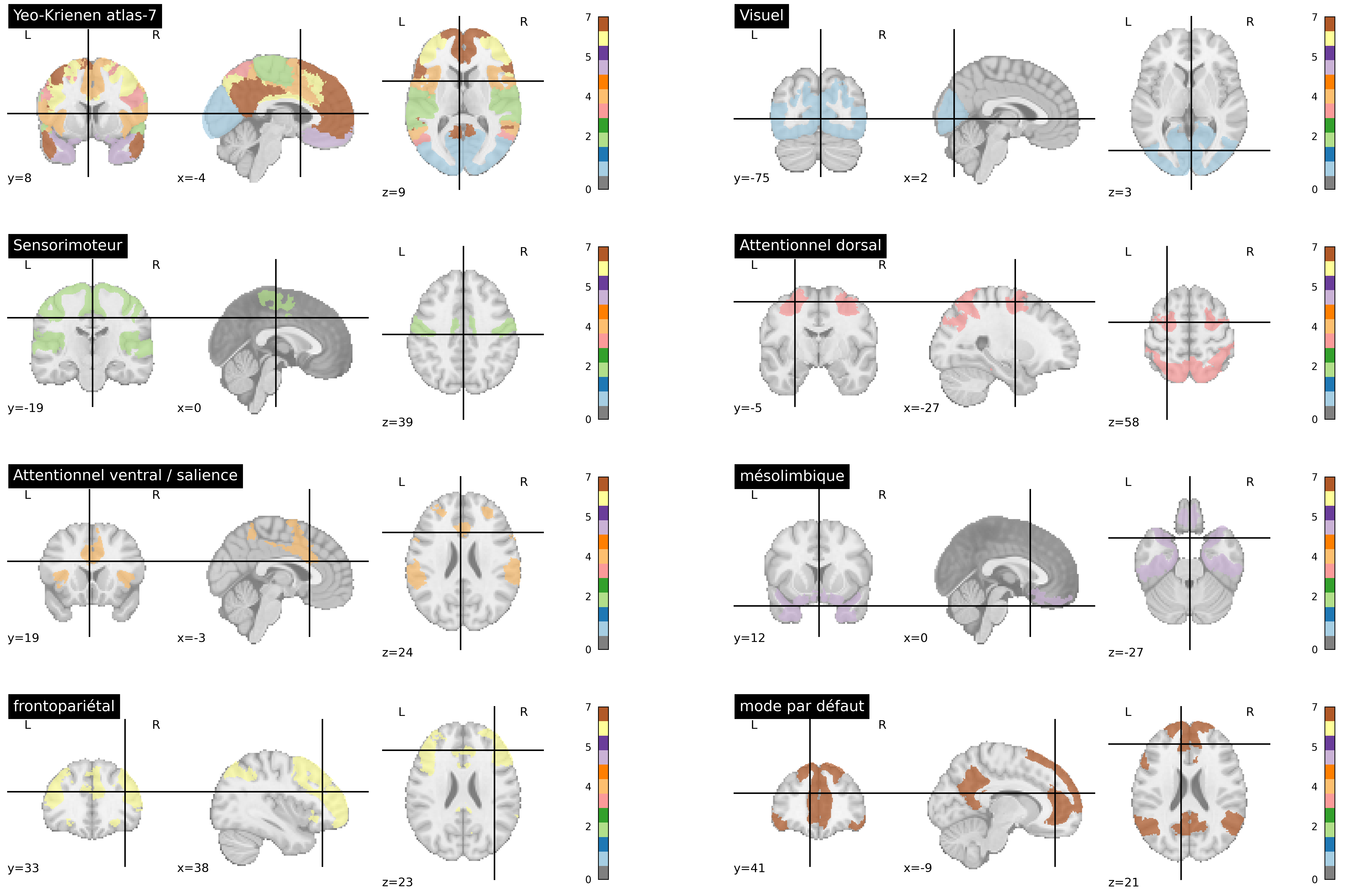
Fig. 62 The Yeo-Krienen atlas [27] is constructed through clustering analysis from resting-state fMRI data of a large number of participants. The networks are defined at multiple resolutions in this altas (7 and 17). Here, the partition into 7 large distributed networks is presented. This figure is generated by python code using the nilearn library (click on + to see the code), and is distributed under the CC-BY license.#
There are standard atlases of resting-state networks that have been generated on a large number of participants. The atlas developed by Yeo, Krienen and colleagues [27] is widely used and identifies seven major networks, as seen in Fig. 62. Some of these networks have already been discussed in this chapter: the default mode network, the dorsal attention network, and the sensorimotor network. We should add two other associative networks: the frontoparietal and ventral attentional networks. There is also a visual network and a mesolimbic netwrok involving the temporal pole and orbitofrontal cortex. Note that this altas ignores all subcortical structures, and that there is no exact number of brain networks, but rather a hierarchy of more or less specialized networks.
Multiple resting-state networks
Many articles have studied a partition into 7 cortical networks. However, the study by Yeo, Krienen et al. [27] also proposed a partition into 17 sub-networks, and since then, several atlases with hundreds of regions have been proposed. You can use this interactive tool to explore the multi-scale organization of functional networks interactively, using the MIST atlas [28].
Conclusions#
Functional connectivity involves measuring the coherence (correlation) between the activity of two regions (or voxels) in the brain.
A functional connectivity map allows the study of connectivity between a target region and the rest of the brain.
A functional network is a group of regions whose spontaneous activity exhibits strong intra-network functional connectivity and weak connectivity with the rest of the brain. Various resting-state network atlases exist, at different scales.
Exercises#
Exercise 1
Connectivity map: True/False
A connectivity map changes if we change the target region.
To define a target region, we need to do an activation map.
The values in a connectivity map vary between 0 and 1.
An fMRI activation map is a tool that can be used to identify the default mode network.
Exercise 2
Functional networks: True/False
A functional network is composed of voxels/regions exhibiting strong functional connectivity
The regions within the default mode network are negatively correlated with the regions with the sensorimotor network.
Resting-state network atlases identify between seven and several hundred resting-state networks.
Exercise 3
Choose the correct answer:
Spontaneous brain activity is only observed in a resting state.
Brain activity evoked by a task can be characterized by an fMRI activation map.
Connectivity maps can reveal brain activity during a task or at rest.
Answers 1 and 2.
Answers 2 and 3.
Exercise 4
Choose the correct answer:
Functional connectivity is measured between two regions.
Functional connectivity is measured between one region and all voxels in the brain.
Functional connectivity is measured between all pairs of regions in an atlas.
Answers 1 and 3.
Answers 1, 2 and 3.
Exercise 5
We have a brain region atlas and we select a target region in the posterior cingulate cortex (PCC). For a resting-state fMRI dataset, we calculate a functional connectome using the atlas, as well as a connectivity map using the PCC as the target region. Explain one similarity and one difference between the column of the connectome corresponding to the PCC and the connectivity map (PCC target).
Exercise 6
We compare resting-state functional connectivity between a group of young people and a group of older people. Connectivity maps are generated with a target region in the posterior cingulate cortex. Statistical tests are applied, and a decrease in connectivity with the medial frontal cortex is identified. Propose three hypotheses that could explain this observation.
Exercise 7
To answer this question, read the following article by Shukla et al., “Aberrant Frontostriatal Connectivity in Negative Symptoms of Schizophrenia”, publié dans Schizophrenia Bulletin (2019, 45(5): 1051-59) and available in open access at this address. The following questions require short answers.
Which software was used to analyze the fMRI data?
What experimental condition was used during the fMRI acquisitions?
What was the spatial smoothing parameter?
Were the data corrected for motion? How?
What filtering procedures were applied?
In which stereotaxic space were the group analyses conducted?
Which atlas of regions was used?
What type of connectivity measure is used in thise article?
Bonus#
These bonus exercises are related to the following video “resting-state network”:
Show code cell source
from IPython.display import HTML
import warnings
warnings.filterwarnings("ignore")

# Youtube
HTML('<iframe width="560" height="315" src="https://www.youtube.com/embed/_Iph3WW9UOU?start=18" title="YouTube video player" frameborder="0" allow="accelerometer; autoplay; clipboard-write; encrypted-media; gyroscope; picture-in-picture" allowfullscreen></iframe>')
Bonus exercise 1
“La septième jour” (sic), excerpt in French with English subtitles: 0:54 - 4:35
Who does the young man represent?
What result is he referring to?
Who does the young woman represent?
What result is she referring to?
Why call this film “la septième jour” (“the seventh day”) ?
Excerpt from “Neuro meteorology”: 4:48 - 5:30
Let’s have a look at upcoming intrinsic activiy for the weekend. As you can see here, the default mode network and task positive network are up to their usual shenanigans, in and out, yin and yang. Looks like the usual pattern of daydreaming and intense concentration for the weekend. Default looking a little bit dominant. Visual looking good, motor looking good, as long as there are no sudden alcoholic fluctuations in form the south. An updated real-time satellite imagery indicates some turbulence in the precuneus region that could get very interesting early in the week. But, as the latin philosopher Seneca said: rest is far from restful.
Bonus exercise 2
“Neuro meteorology”: 4:48 - 5:30
Which networks are being discussed here?
Why does he describe the default mode network and the “task-positive” network as “Yin and yang”?
Are there any networks missing in this prediction?
Why are turbulences in the precuneus (or rather the posterior cingulate cortex) interesting?
Excerpt from “Hardball”: 8:01 - 9:46
Host (H): “Welcome, with me today we have two esteemed researchers. On my right, Dr Yann Schnizel, and on my left, Dr Paul Salami. Are you ready to knock some balls?”
Paul Salami (PS): “Now I’m going to say that the growth in default mode and resting state literature proposes good questions and good experiments, and these are all largely beneficial to the youngsters making their way to research, but I honestly don’t think that studying resting-state is particularly useful. You want to study behavior, you do it the old-fashioned way, like we used to do it. You’d do it experimentally.”
Yann Schnizel (YS): “This is not so! The important distinction is not between rest and tasks, but rather between intrinsic and evoked activity.”
PS: “If we both agree that spontaneous activity is present in all cognitive states, I don’t see why we have to link it specifically, specifically right, to rest.”
YS: “We certainly don’t need to exclusively study it at rest, but the resting state is the condition under which these spontaneous fluctuations have most extensively been studied.”
PS: “But that is fundamentally unpsychological!”
YS: “No!”
PS: “Unpsychological!”
YS: “YOU are fundamentally unpsychological!”
PS: “At least I’m willing to study cognition in the moment of the cognitive event.”
H: “Whoa whoa gentlemen, it’s getting a bit hot in here! Let’s take things down a notch. Actually, looks like we’re just about out of time.” (fight between PS and YS)
H: “Next week on “cluster analysis”, we will be hitting the road with Michael Milham, legendary folk singer. He’s traveling the road sharing the history of the resting-state network, in songs. Thank you for watching cluster analysis of the resting-state network,”
Bonus exercise 3
“Hardball”: 8:01 - 9:46
Is it true that spontaneous activity is present both at rest and during a task?
Is it true that spontaneous activity has been mainly studied in a resting state in fMRI?
In what way is it “unpsychological” to study a resting condition?
Open question: is one of them right? Or both?